sector
Publicity
Role
Product Designer
Type
Generative identity system
timeline
2021
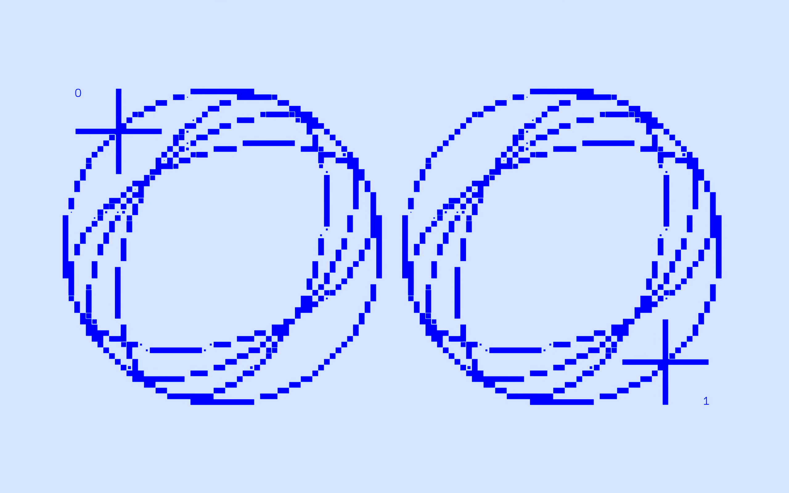
Echoform is an investigation into repetition and resonance in digital spaces. The identity builds a layered visual system using generative glyphs to simulate echo chambers—where repetition distorts clarity over time. The intention was to explore how small visual loops, when repeated, can become both meaning and noise. This foundation allowed the system to scale from micro-patterns to complex digital identities.
Research-led development
The project began as a visual inquiry into how cognitive and cultural loops can be mirrored in design. Drawing from research into algorithmic filters and network behavior, we mapped out visual equivalents to repetition, reflection, and feedback. The resulting glyphs became artifacts of these loops—mirrors that didn’t just reflect but multiplied input. It was critical that the system remain flexible, but still thematically unified.
Modular system design
Echoform was built on a modular typographic grid that allowed for infinite iteration. Using polar and axial symmetry as compositional rules, the project developed a library of pattern primitives that could be recombined, extended, or glitched. We used these modules to generate both high-density textures and sparse, meditative layouts, depending on context. This approach ensured the identity felt algorithmic but never sterile.
Analog interference
To prevent the system from becoming overly technical, we introduced physical imperfections—scanned ink, soft shadows, and distressed transparencies. These tactile layers humanized the work, contrasting the mathematical precision of the core system. It added a necessary friction to the digital slickness, reinforcing the central question: when does repetition become identity, and when does it become distortion?
Applications in use
The final identity system extended across both print and digital outputs. We applied the Echoform visual language to posters, interactive installations, and motion graphics—each iteration remixing the core logic in new ways. The system’s modular nature made it ideal for adaptive branding, speculative design, and editorial storytelling. Ultimately, Echoform functions as both a brand and a concept: a meditation on identity, systems, and the aesthetics of recursion.
Project 01
Where to go

Project 02
Gatherer

Project 03
Connected Machines
