sector
Healthcare
Role
UX Research, AI, Product Design
Type
AI Assistive Tool
timeline
2024
Design of an LLM screening experience that improved patients' medical appointment scheduling process, and saved the health insurance company millions on emergency care for non-emergency patients.
Where I went
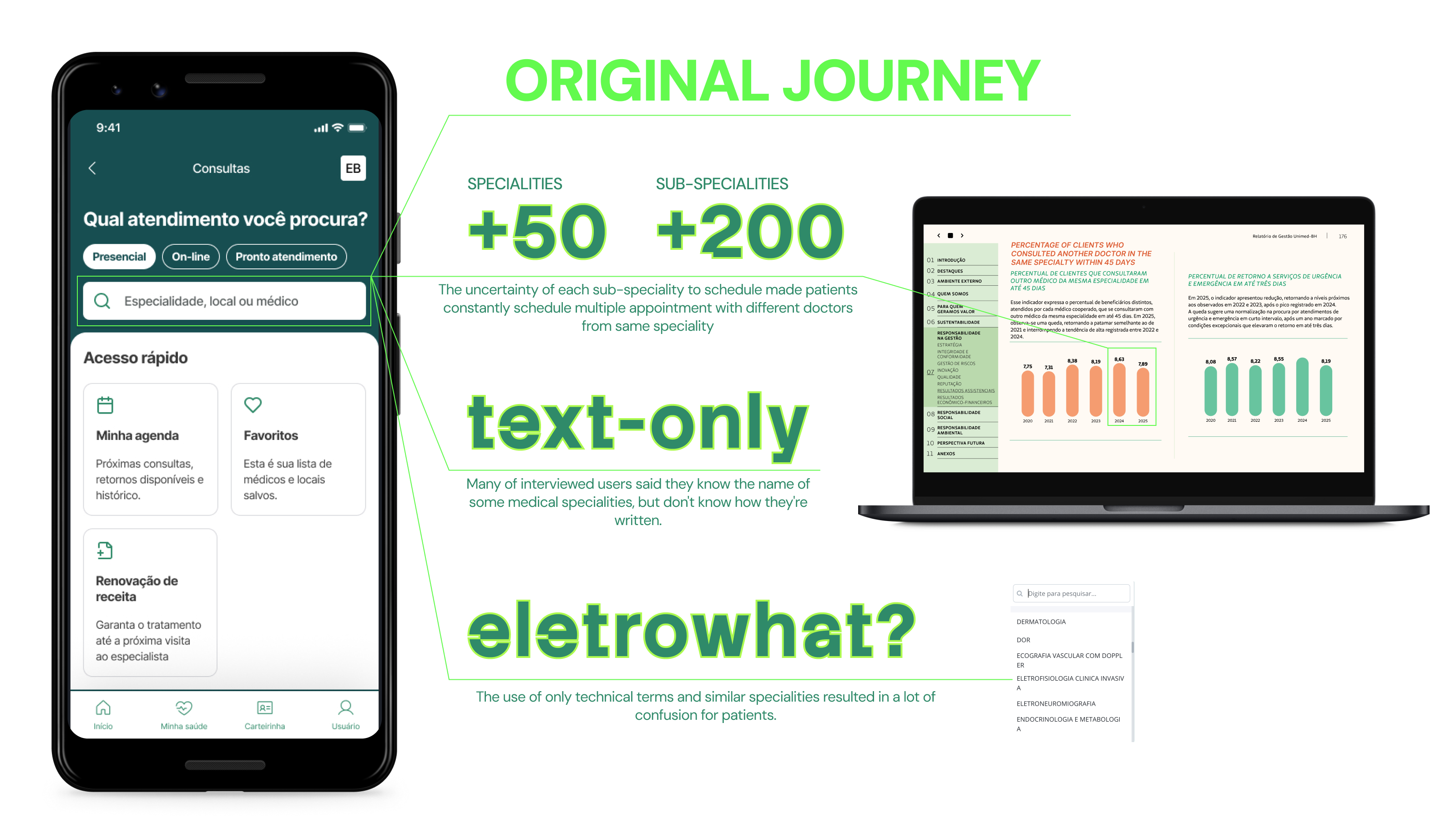
The wide range of medical specialties currently offered has complicated the task of scheduling a medical appointment, which can delay patient treatment, hinder access to the care they need, and turn health care into a frustrating experience.
At the same time, the longer the patient waits to schedule an appointment, the more likely they are to end up at the ER, even with no urgent care needs. But the average ticket for an ER patient is 4 to 9 times more costly than a simple scheduled appointment with a specialist.
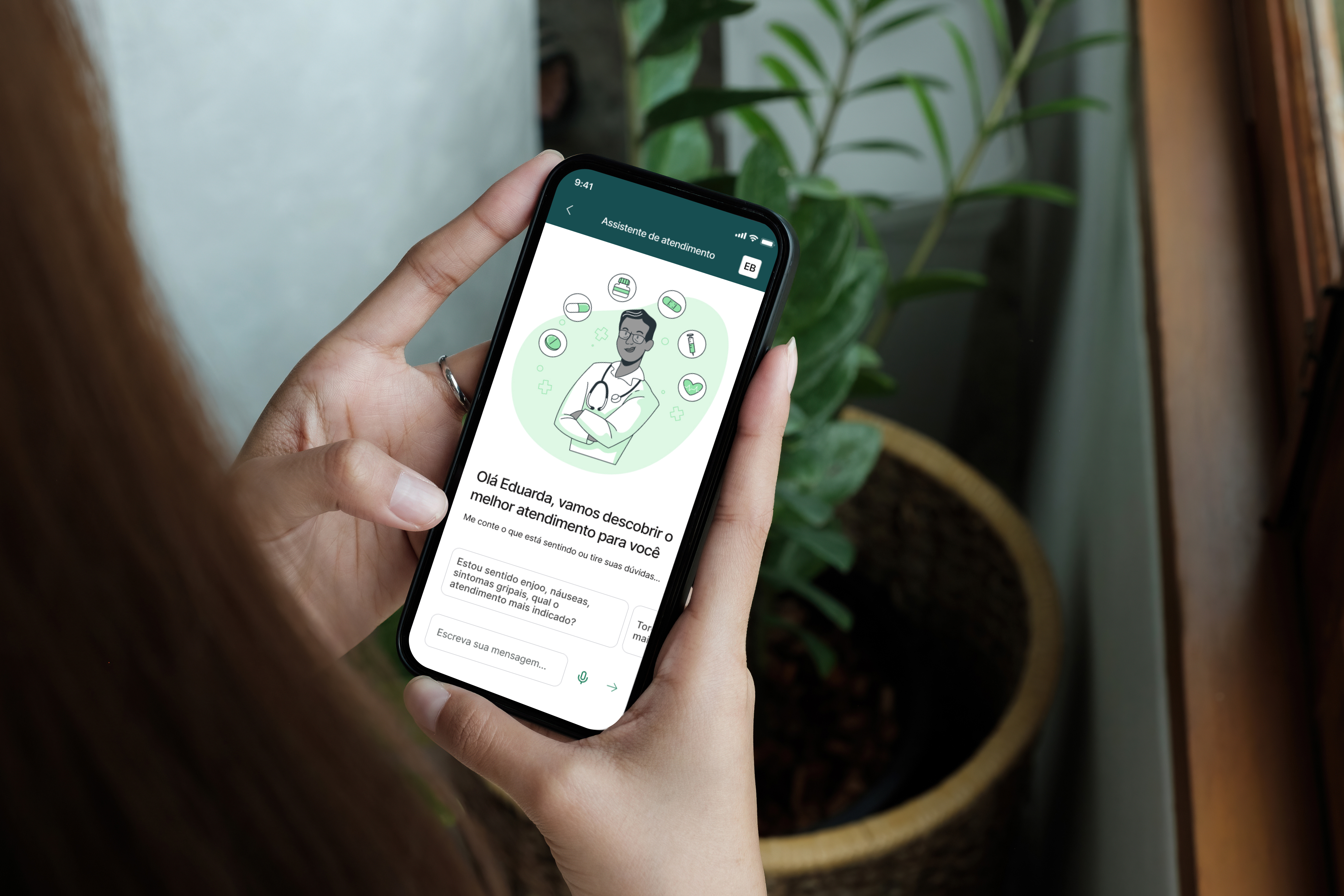
Our large language model (LLM) developed specifically to apply medical protocols in natural speech to guide patients in finding the most suitable medical specialty and scheduling appointments efficiently from symptoms descriptions as broad as "felling something weird”.
Show me where it hurts
I interviewed doctors and patients to understand their real pains regarding how their appointments were scheduled. After hearing over 200 people on different subjects on the medicine of the future, these feelings regarding visiting doctors' specialities caught my attention.
An apple a day...
Patients tend to postpone care seeking, opting for schedule an appointment only after they have been experiencing symptoms for some time.
It's not that serious, is it?
Depending on the delay in seeking care, the case can indeed become an emergency, but generally, the main consequence is the burden of living with symptoms for a longer period.
Excuse me, do you work here?
Patients may require up to 3 consultations with different doctors until they get to the speciality or sub-speciality they need.
I'm just a robot
As this is a health application, it was essential to balance the empathy and warmth of medical care with the efficiency of the AI engine. This required extensive testing of the virtual assistant's tone, as being overly welcoming could prolong the interaction and frustrate the patient, while not being warm enough could discourage usage.
Also, it was very important to distinguish this automated screening from a real online medical appointment. The patient needed to understand that this was an AI interface, even if they could speak naturally with it, this was still not a licensed doctor.
Houston, we have a problem. Actually, two problems.
After launching and watching the usage of a larger audience, I was able to spot some necessary changes to the first version's journey and interface.
Hello, who is talking?
After 3 months of observation, almost a third of the completed journeys, 26,13% to be exact, were triggered by a family member of the patient showing symptoms, not the patient himself. Which meant that information from their health history such as age or previous appointments were being wrongly inputed to the decision tree.
A simple question changed everything. Before starting the conversation, the LLM would search for every family account connected to that user, and ask: "Who is the appointment for?".
I'm really just a robot
Despite my best efforts there were still some users who thought they were speaking to a real person, doctor or secretary. So I removed every medical visual reference from the feature. The visual became a bit duller and less delightful, but got the job done and changed users' perspectives on who was really on the other side.
Project 01
Where to go

Project 02
Gatherer

Project 03
Connected Machines
